Reference color spaces
As in any field, when it comes to calibration, we must always perform calibrations against a reference or a standard.
The graphic chain is no exception to the rule. This is why it is necessary to use reference color spaces to standardize the colorimetric renderings.
The problem is that different devices cannot capture, display or print the same colors.
To remedy this, reference color spaces have been defined according to the destination of the images to be reproduced.
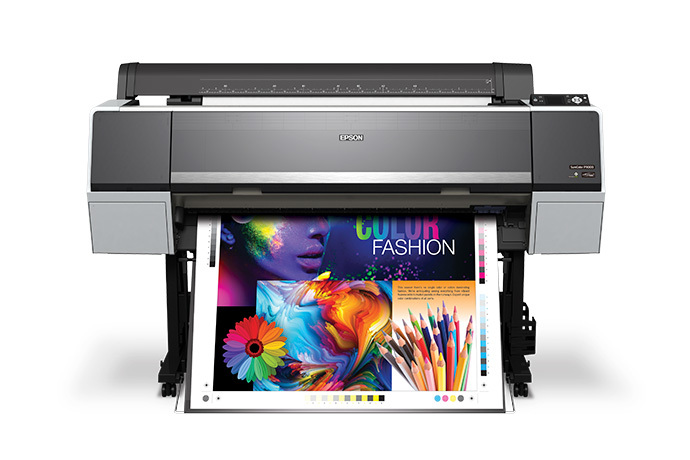
| The web - office screen | Digital printing |
 |
|
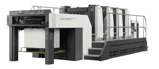
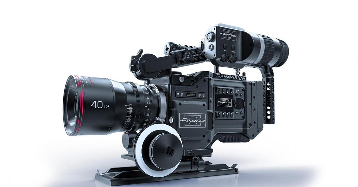
| Industrial printing | The video |
 |
 |
| Silver photo print | APN |
|
Smart phone & tablet |
|
|
|
|
The most common reference profiles:
RGB space:
- sRGB Color Space Profile.icc : Generic color space for office automation screens
Color space used to process images intended for websites on the web, silver photo prints and images for "general public" use.
- AdobeRGB1998.icc : Color space created by Adobe in 1998. It was designed for graphic designers whose screen work is intended for printing.
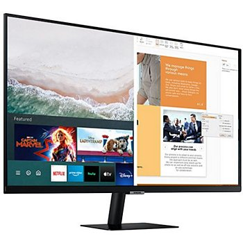
- Display P3 : Color space for office screens larger than sRGB (new generation Apple screen, tablet and smart phone)
ProPhoto.icc : Color space created by Kodak in 1980 and based on the set of colors that the eye is able to see.
The downside of this model is that display and printing devices are far unable to reproduce the colors of its gamut.
This color space is generally used for processing RAW images from digital cameras.
Video :
REC709 : Recommendation Rec. 709, entitled " Parameter values of HDTV standards for production
and international program exchange ”, is an audiovisual industry standard for high definition television (HDTV).
REC2020 : Recommendation Rec. 2020, is an audiovisual industry standard for ultra high definition (UHDTV).
DCI P3 : DCI-P3 has a wider gamut than Rec 709 designed for Movies , taken up by sRGB for computer screens . It constitutes a step for access to Rec 2020 , providing for a larger color space 1 . sRGB reproduces approximately 36% of all visible colors; DCI-P3, approximately 45%.
CMYK space:
Generally, the CMYK reference profiles are taken from the standards used in the field of graphic arts.
We will tackle this subject in a chapter dedicated to Fogra and IDEAlliance standards.
PrintWide2020 ; PrintWide is a very wide gamut CMYK reference space designed to encompass the gamut of
all inks or dyes in all known color printing systems.
Although the dataset has only four channels (CMYK), its gamut includes the effect of typical "wide gamut" inks such as OGV (Orange, Green and Purple) or RGB (Red Green and Blue) often. used in inkjet, flexo or offset printing.
Representation of Gamuts
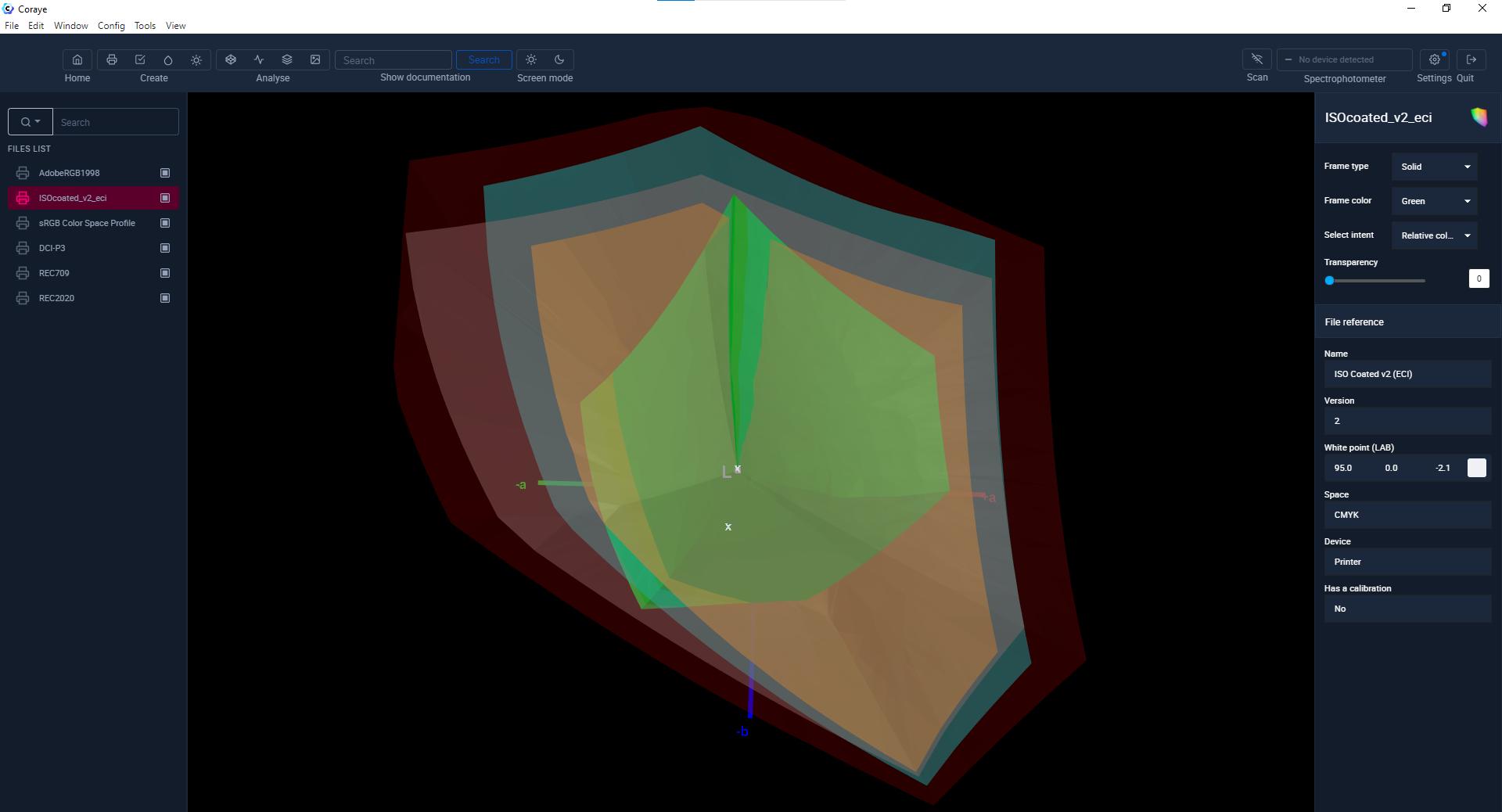
In order to illustrate the differences between reference spaces, we are going to display a few of them in the gamut viewer.
Remember that the greater the volume of the gamut, the greater the number of colors that we will be able to reproduce.
From the smallest to the largest gamut:
- Isocoated_v2_eci.icc (CMYK offset printer) (green)
- sRGB and REC 709 (web, HDTV & general public) (yellow)
- DCI P3 and Display P3 (green)
- Adobe RGB 1998 ( light red)
- REC 2020 (UHDTV) (dark red)
How to optimize the colors of your prints?
Your printer is capable of reproducing a number of colors.
This will depend on its technology, the inks used and the media for printing.
If you want to optimize the colors of your prints, choose the color space that will allow you to do so.
Let's take an example:
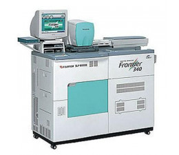
I want to print images on an Epson SC-P7000 printer that uses C, M, J, N, lc, lm, lg, llg, Orange and Green inks.
Let's compare the colors that the printer is able to reproduce with the sRGB.icc reference space
As we can see, it would be a shame in this case to convert the images to sRGB.icc for printing, because the sRGB. icc is very limited in the reproduction of "blue-green".
Now let's compare the Adobe RGB 1998.icc color space with this same profile of the Epson SC-P7000 (CMYK + Orange and Green inks)
Adobe RGB 1998.icc having a larger gamut (volume) you will be able to reproduce prints with more saturated "blue-green".
This is very interesting for the reproduction of photos of landscapes (sky and azure blue sea for example).
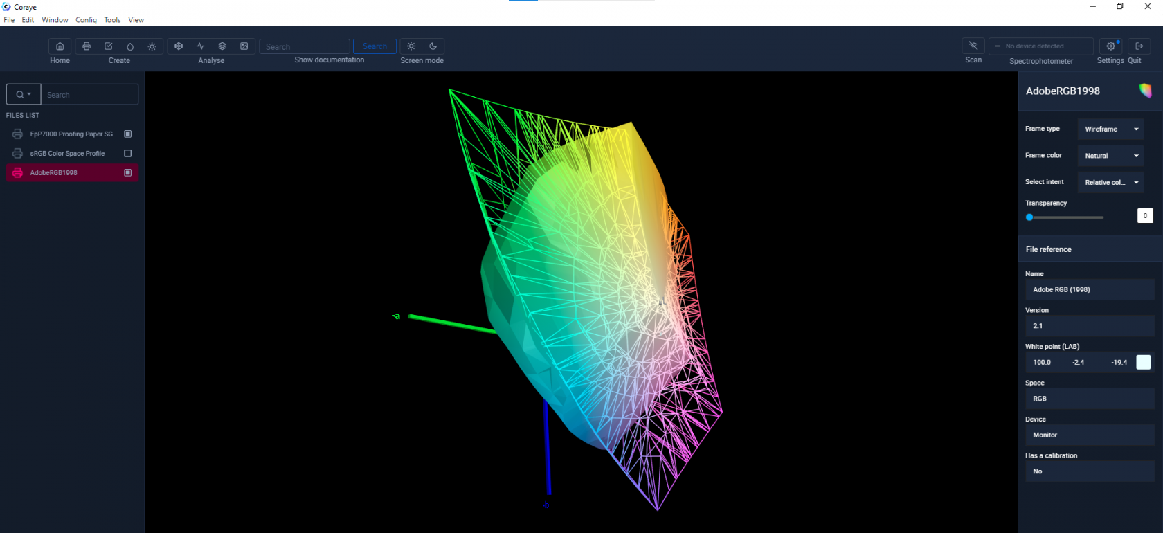 Profile Epson P7000 vs Adobe RGB 1998.icc
The new CMYK PrintWide2020.icc reference profile optimizes prints made on printers with extended gamuts using CMYK, Orange, Green and Violet inks.
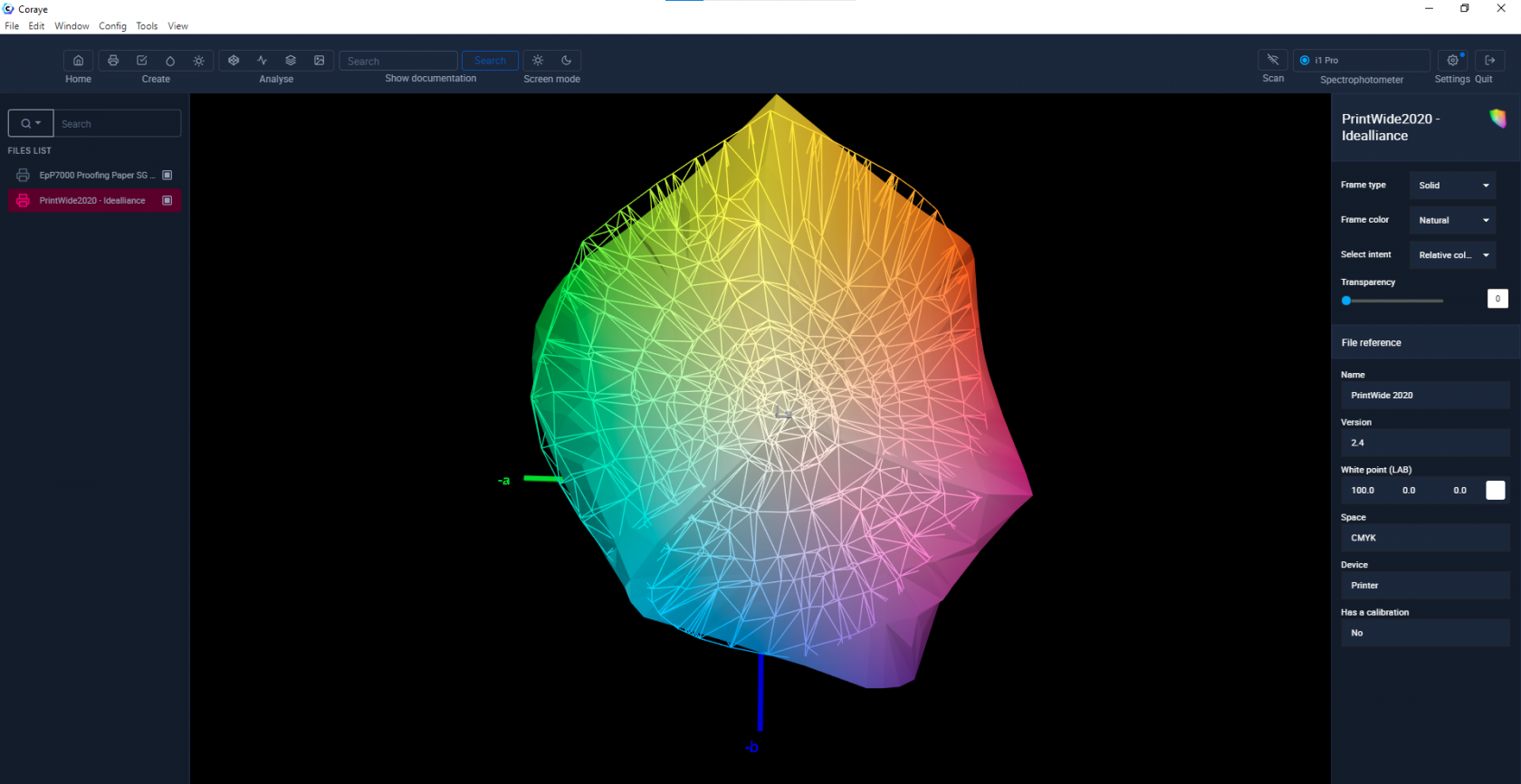 Profile Epson P7000 vs PrintWide2020.icc
Adobe RGB 1998 space vs sRGB 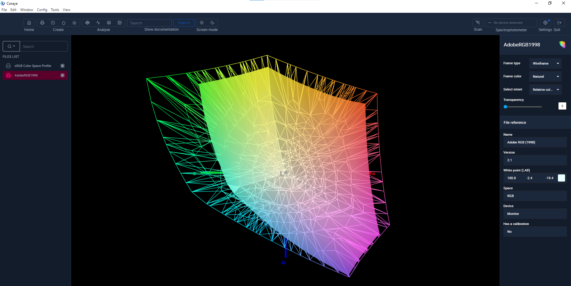 Adobe RGB 1998 space vs sRGB
Conclusion
To optimize the reproduction of your images, choose a color space suited to the reproduction capabilities of your devices.

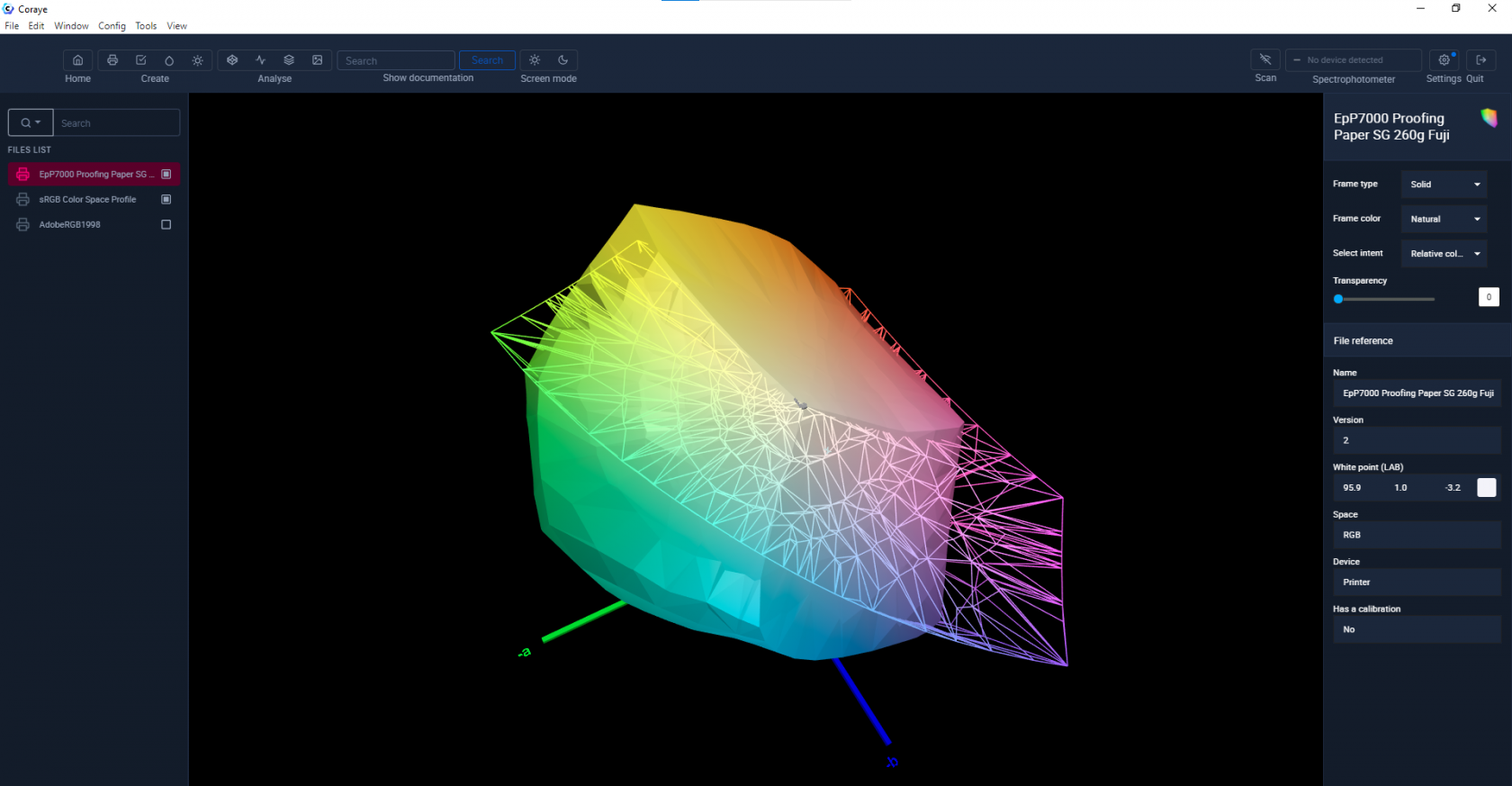 Epson P7000 vs sRGB profile