Pantone color charts
Did you know that the Pantone® company, in those early days, manufactured varnishes to cover the nails of these ladies?
Today we know them mainly for their color charts used in the field of printing and industry.
Because if these "Pantoniers" are useful for colorists, they have become reference points in the field of color.
They are used to communicate, research and control colors.
But beware ! misused, they could cause a lot of problems ...

The history of PANTONE
This remains the primary function of the pantone color chart.
PANTONE Colors
These 13 basic colors were supplemented, in the years following their development, by 5 other colors.
What means that today, the pantone color chart, is a variation of 18 basic colors:
- Black primary ( black );
- White transparent ( white transparent ) to lighten the color;
- Yellow primary ( yellow );
- Rouge (bright red) ;
- Warm red ( warm red );
- Ruby red ( rubine red );
- Rhodamine red ( rhodamine red ), or magenta ;
- Rose (pink) ;
- Violet (purple) ;
- Blue ( dark blue );
- Reflex blue , a sort of very pure indigo blue ;
- Primary blue ( process blue ), stronger than cyan ;
- Vert (green).
- Red 032 ( pure red );
- Orange 021 ( pure orange );
- Yellow 012 (a more intense yellow than the primary yellow);
- Violet
- Blue 072 (a less purplish blue than the reflex blue).
Pantone, by combining these primary inks created thousands of colors.
Depending on the media on which the inks are printed, the color rendering will differ.
This is why there are several PANTONE (Pantonier) color charts such as:
- Pantone C (coated), for coated paper ;
- Pantone U (uncoated), for uncoated paper;
- Pantone M (matted), for matt paper.
The advantage of PANTONE inks for a printer, is to print colors which cannot be reproduced in CMYK or to carry out prints in the field of packaging.
But beware, the use of additional colors in traditional printing at a cost ...
PANTONE and digital printing
In digital printing, (take inkjet for example), printers can use Cyan, Magenta, Yellow, Black, Orange, Green, Violet, Red, Blue inks to reproduce saturated colors.
But also clear inks (Light) to increase the quality of pastel colors.
There are also white, metallic, fluorescent inks, etc ...
Each printer is able to reproduce a certain number of shades depending on:
- Its technology (Piezo, thermal, flexo, etc ...)
- The type of ink used (Eco solvent, latex (resin), pigment, sublimation, etc ...)
- The number of different inks that compose it
- The media on which we print (paper, fabrics, vinyl, tarpaulin, etc ...) )
- etc ...
Inkjet printers are therefore capable of reproducing a much larger color space than an offset printer which prints with CMYK inks for example.
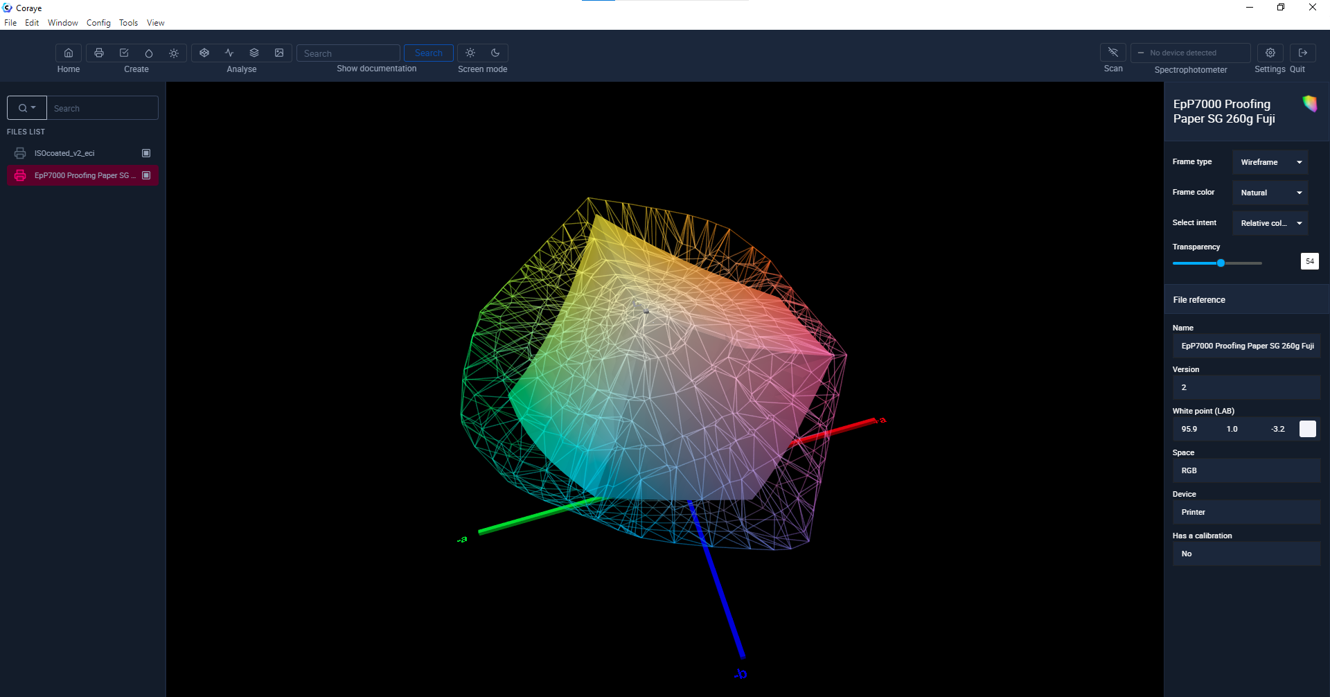 Isocoated v2 eci.icc (Fogra 39) vs Epson P7000 papier de type photo
So the PANTONE color chart can only be used as a reference to print a color.
The question we can ask ourselves is: Is the printer capable of reproducing all the colors of a PANTONE color chart?
Remember that the Pantone C, U or M color charts are lexicons of additional inks intended for traditional printing.
PANTONE and textile printing
There are other color charts for printing textiles
- Pantone TCX (Textile on cotton)
- Pantone TPX (Textile on paper)
- Pantone TPG (Textile on paper)
- Pantone fashion home + interiors
- etc ...
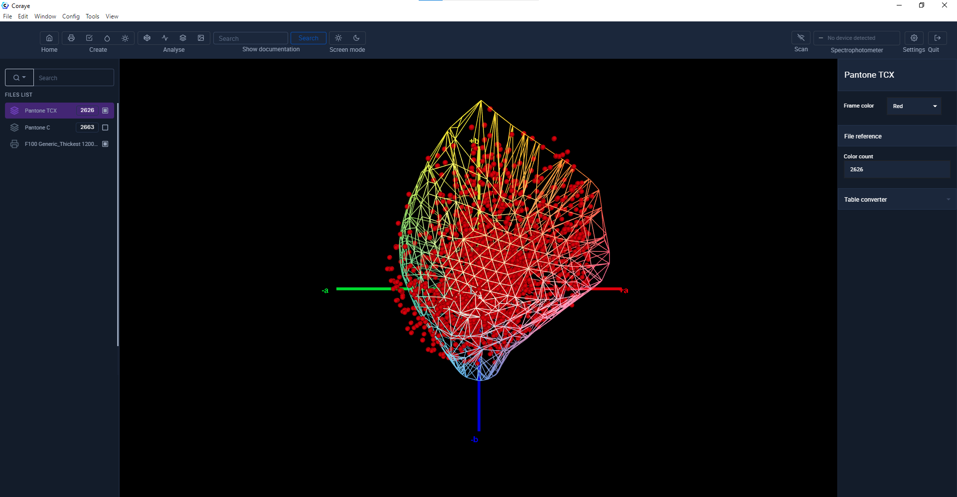
As we can See it by comparing a Pantone C color chart (in white) and a Pantone TCX color chart (in red), the colors in the Pantone C color charts contain more saturated colors.
 Pantone TCX (Rouge) vs Pantone C (Blanc)
Now let's compare the profile of an Epson SC-F10000 printer using sublimation inks for printing on polyester fabric, we can see that the Pantone TCX color chart is more suitable for this printing technology.
We can also see that there are colors from the color chart (in the blue-green) that we will not be able to reproduce.
But there are also a lot of colors that are not in the Pantone TCX color chart that we could reproduce (Green, Yellow, Red, Blue eg)
 Pantone TCX vs Profil Epson F10000 sublimation textile
In conclusion, if you want to use Pantone color charts to define the colors you want to reproduce, use suitable color charts.
Otherwise ask your printer to print the color charts for you under normal printing conditions and use the colors provided by your printer.
In which color mode are Pantone colors defined?
As we have seen previously, Pantone colors can be used in printing to reproduce colors that are not reproducible in CMYK.
So the CMYK color space cannot be used because:
1) CMYK is dependent on a reference profile
2) There are Pantone colors which are not reproducible in CMYK
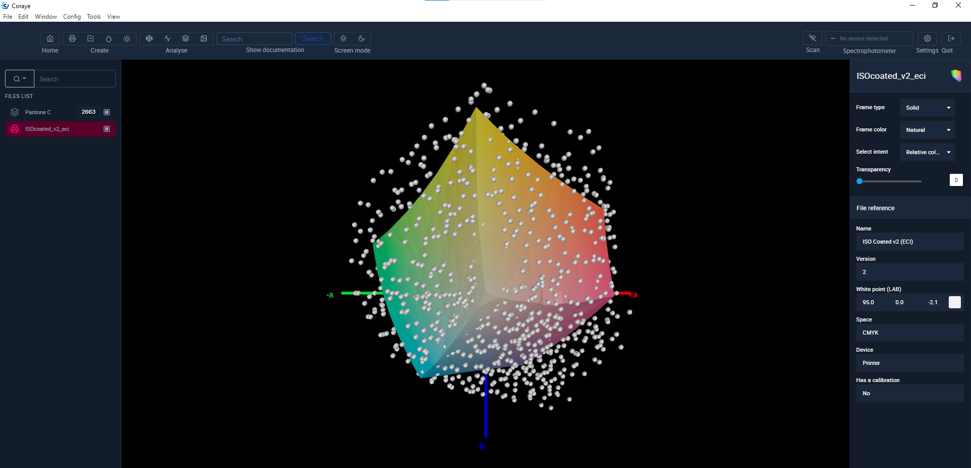 Pantone C vs Isocoated v2 eci.icc (Fogra 39)
The color space generally used to define a Pantone color is the Lab because it is an independent color mode which relies on the perception of the human eye.
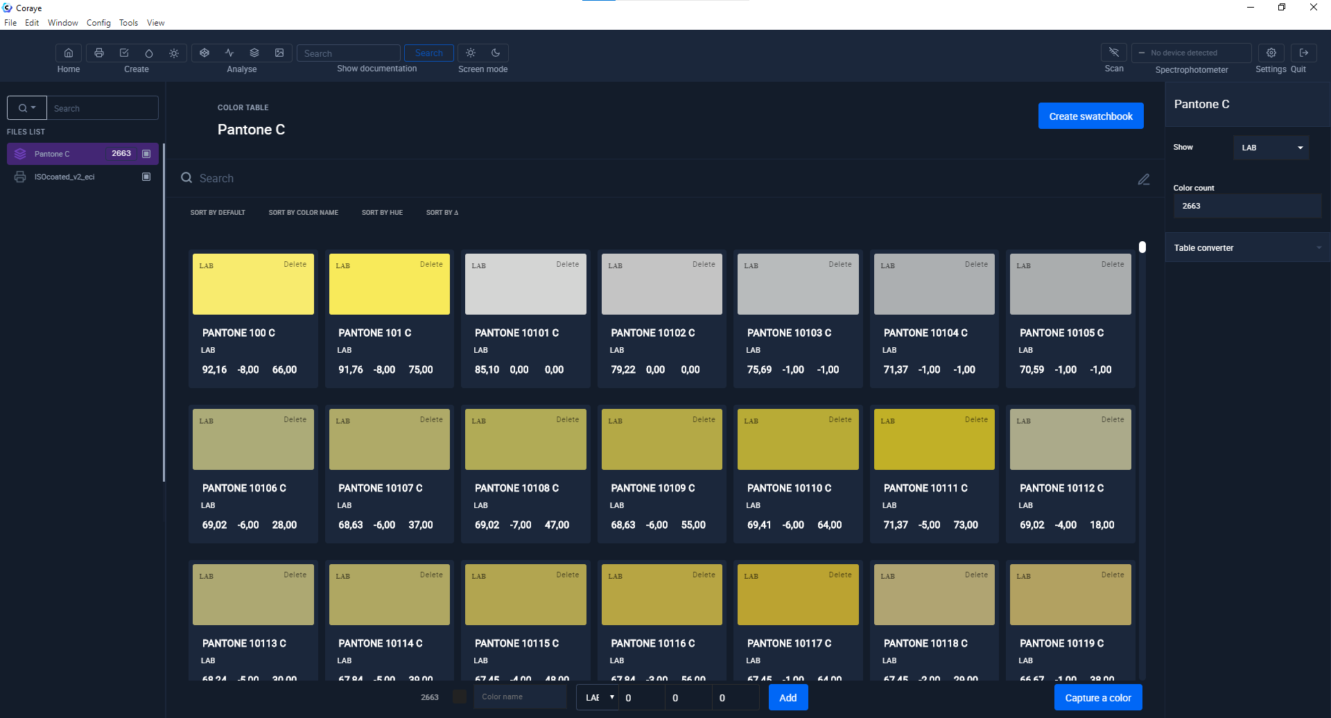 Lab values of a Pantone color chart
Paper swatches
The only purpose of paper color charts is to help choose a color, but they do not claim to be precise enough to allow color control.
The visual control also depends on the state of your Pantonier, the light environment in which you will visualize your colors and ... on you!
Because you probably know, color is subjective.
From the first day of use, your color charts can have significant deviations. Colors printed on a Pantone® color chart cannot have absolute values and are necessarily reproduced with tolerances.
Without forgetting the updates.
The current Pantone® solid coated color chart contains 2663 colors, and yours?

So digital?
It is indeed the most reliable solution because by using a spectrophotometer and an adapted software that brings us the following advantages:
- Measurement precision
- Use of spectral values or official Lab
- No interpretation of color
- Control of conditions under which the measurement is carried out.
- Precise quantification of the difference between the measured color and the reference values.
- Recording and sharing of information for better communication.
- Update of color charts
- More reliable and faster shade search.
- Creation and use of personalized color charts (samples of leathers, fabrics, vinyl, etc.)

Pantone + Color Bridge swatches
Attention danger ! these swatches do not contain the values of the reference Pantone colors, but the Pantone colors converted to CMYK.
So this gives reduced colors to the CMYK space, it can only be useful for offset printing to preview what your Pantone color will give you in CMYK if you will not be using an additional Pantone color.
The question is:
- Is the CMYK space that my printer will use the same as the one used to convert Pantone colors on my Color Bridge swatch?
- Do I need a Color Bridge CMYK swatch when printing on a 12 color inkjet printer?
Similar articles:
https://www.coraye.com/en/posts/de-la-creation-a-limpression-episode-10-2
https://www.coraye.com/en/posts/from-creation-to-printing-episode-9
https://www.coraye.com/en/posts/de-la-creation-a-limpression-episode-8-2
https://www.coraye.com/en/posts/from-creation-to-printing-episode-6
https://www.coraye.com/en/posts/from-creation-to-printing-episode-5
https://www.coraye.com/en/posts/from-creation-to-printing-episode-2
https://www.coraye.com/en/posts/from-creation-to-printing-episode-1